
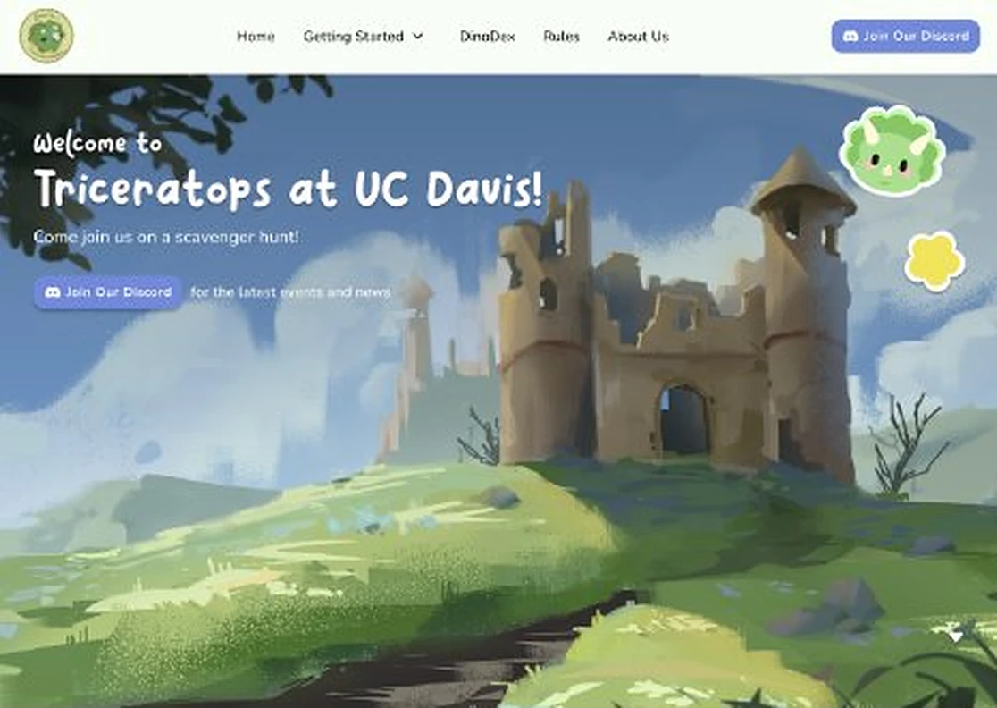


Turning a scattered Discord into one clear starting point for new dino hunters.
UC Davis Triceratops is a campus club built around crochet dinosaur scavenger hunts. Members follow clues to find dinos hidden in the wild, and the club doubles as a place for community and downtime from the stress of school.
On a contract with the club, our team acted as UI/UX designers and developers to build a static website that pulls information out of Discord and into one place, then sends visitors to the club's Discord and Instagram. I owned the onboarding side of the site: the Getting Started guide and the Flash Sales guide.
- Designed and built the Getting Started and Flash Sales pages, from lo-fi to hi-fi and into code.
- Ran interviews, synthesized survey data, and helped with affinity mapping, information architecture and a SWOT analysis.
- Developed the site in VS Code, GitHub and Cloudflare, using Claude as an AI coding partner.
Discord was the only way in, and its information was scattered
The only way to learn about hunts was the club's Discord server, where information was scattered and hard for new users to navigate.
The client also handed us a large amount of information to organize. Our job was to turn it into a site that informs new users, keeps interested members up to date, and converts both into the club's Discord and Instagram.
Two of three cohorts: people new to the club
Rules, not discovery, were the biggest barrier to joining
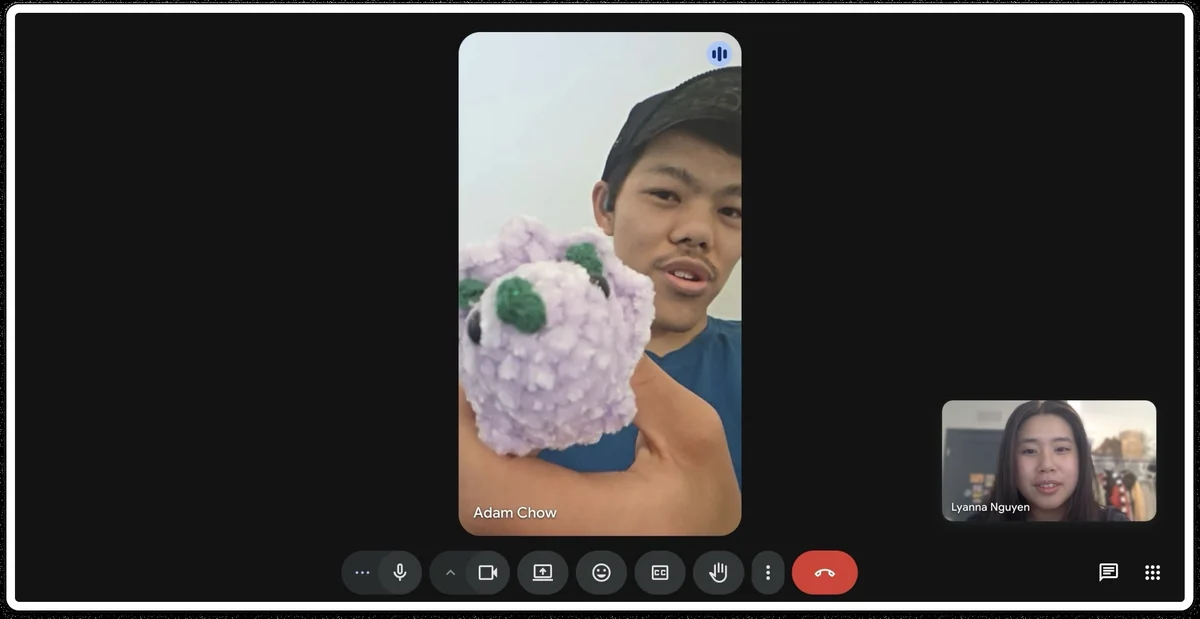
We surveyed each cohort, ran user interviews, and synthesized the results through affinity mapping, information architecture and a SWOT analysis of similar sites.
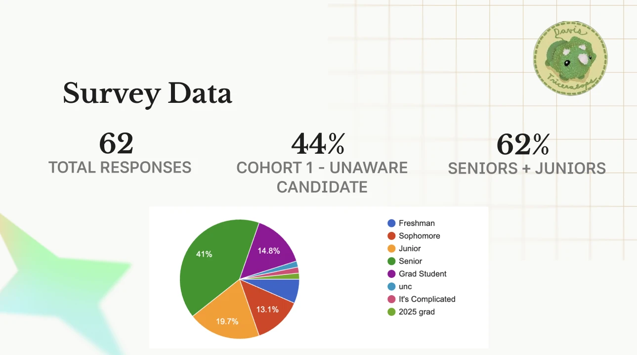
The website's job starts after someone finds the club
- 9 of 15 Cohort 2 respondents said not knowing the rules stopped them.
- Cohort 3 confirmed the rules were hard to understand and scattered across Discord.
- 85% of Cohort 1 would check social media first to learn more. None would check AggieLife.
- The site's job is explaining the club after someone follows the Instagram.
- “I followed the Instagram but I didn't know you had to go on Discord to find drop info.”
- The website can bridge that gap directly.
- 19 of 19 Cohort 3 respondents stay active because they enjoy the drops.
- Only 9 of 19 mentioned friendships, so pages lead with the hunt.
From lo-fi to a live, coded site
We moved from lo-fi to mid-fi to hi-fi in Figma, then built the site ourselves. Hatched blocks show the parts I owned.
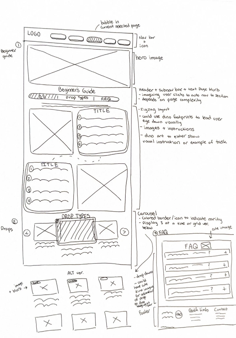
Sketching a zigzag guide that leads the eye down the page
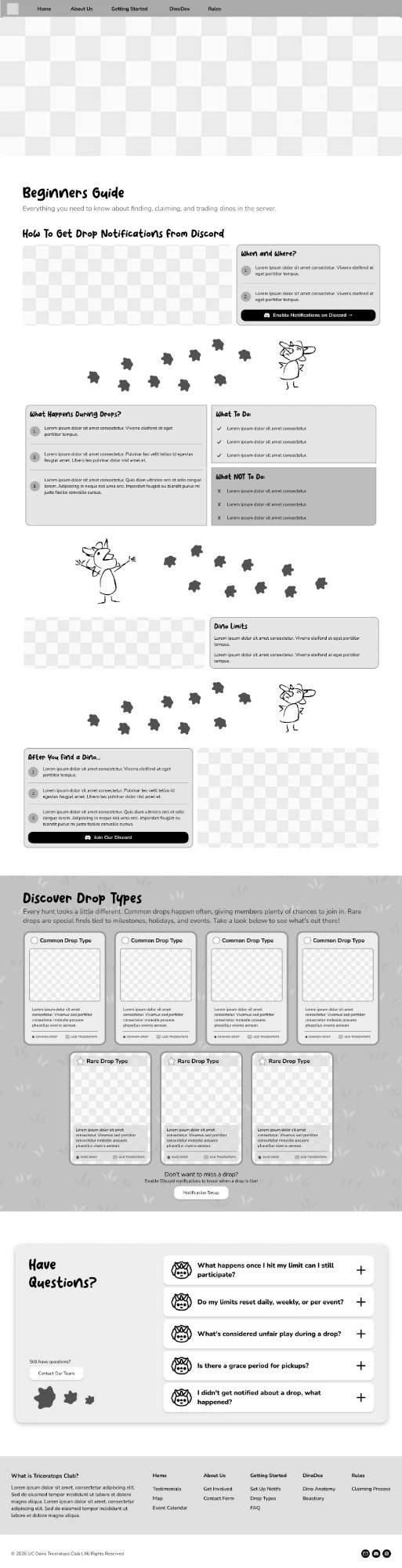
My first sketch of the Beginner's Guide paired images with numbered steps in a zigzag, used dino footprints to guide the eye, and explored a drop types carousel and an FAQ.
Structuring the Beginner's Guide around the questions new hunters ask
The mid-fi broke onboarding into short sections: how to get drop notifications, when and where drops happen, what to do and not do, dino limits, and what to do after finding a dino.
Mentor feedback: too much information, too much at once
The client gave us a large amount of information, and the first versions tried to show all of it. Feedback from industry mentors kept coming back to the same point: the page felt congested and packed with too much competing content.
So I took a step back and reformatted the page to reduce cognitive load. I broke content into short, numbered steps, grouped related rules into clear sections with their own headers, and gave each section more breathing room so new hunters can scan for what they need.

Built with GitHub, VS Code and Cloudflare
Our team developed the static site ourselves, writing code in VS Code, versioning it in GitHub and deploying with Cloudflare. I used Claude as an AI tool alongside me while coding.
Two guides that take new members from curious to hunting
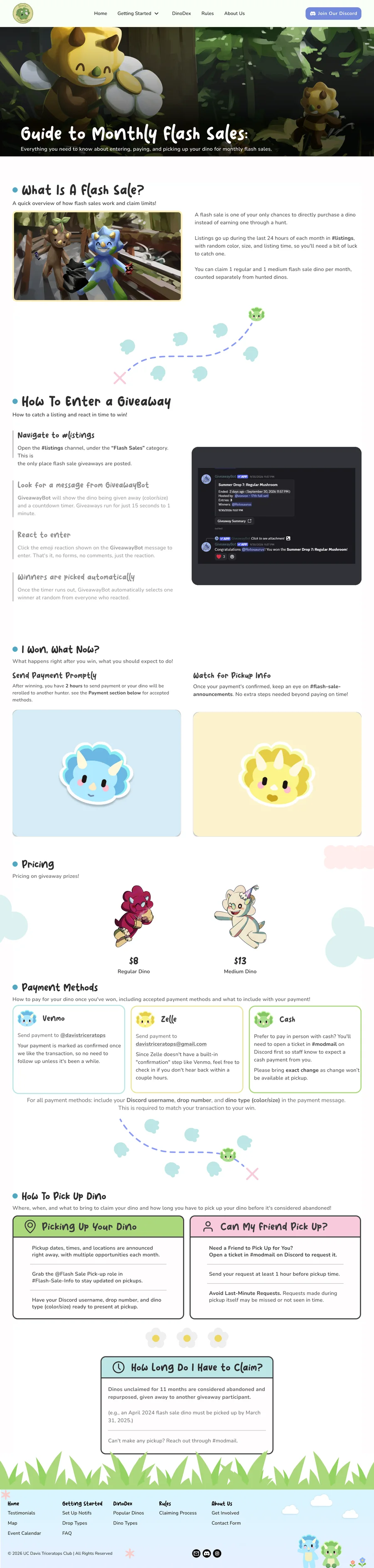
A functional website the club can actually use
The goal is a pushed-out, working website that gives the club one place for the information that used to live only in Discord, and moves new members from Instagram into the hunt.
Launch, then learn from real hunters
Next, we'll launch the site and watch how new members use the Getting Started and Flash Sales guides, then refine the pages based on what they still ask about in Discord.